Impars Project
Coordinator: Núria Garí
Interview
Text: Àlex Sánchez Aragón
Photos: Nuria Garí / Isabel Rovira
What was the first entrepreneurial experience in Valencia?
Very interesting and intense, but economically, a disaster! I came from the world of collectivism, I was a member of antimilitary and feminist groups, related to urbanism, closely linked to the type of city where we wanted to live. We worked with people without resources, in the neighbourhood of La Coma, in the Alosa Park. At the same time we were concerned about self-management, and with a colleague we decided to open our own studio, but the first adventure is always complicated.
From that moment on, how did your career develop?
I wanted to study Fine Arts, but in the end I went to the Design School of Valencia. Thanks to the teachers, especially one in particular, I was put in contact with professional studios in Valencia. After a little over a year, I was hired full-time in a professional studio, so I left my studies.
You decided to prioritise your first job in a professional studio.
I consider myself practically self-taught. I currently teach a Master’s Degree in Book Design and tell my story to the students. I don’t think there is a right way to evolve professionally; that was my experience. The most important thing for a designer is to be curious.
Do you think you’ve developed your own style over the past years?
I don’t think I have a brand of my own. A designer must adapt not only to the client, but to the project. And if I think a customer is wrong with their approach, I’ll let them know. It is common to be asked for a catalogue, for example, and perhaps what they need is a brand redesign. The client knows they have a problem but don’t know how to solve it. I think I have the capacity to listen to the client; in the early stages you are almost a psychologist.
Is there a topic or field that you are particularly interested in?
I feel very comfortable working in the world of culture; I work frequently for museums and cultural institutions, making catalogues. I am currently working on the identity of a poetry book publisher in Catalan. I like to develop “unconventional” projects within the world of design. For example, a label for a brand of bleach or toilet paper.
Why?
It’s always a challenge. We often receive projects to make wine bottle labels. It is a sector where you already have many concepts, and you can predict what the client will want.
And what did you think when you were commissioned to design a trophy for prizes in palliative care?
I was really motivated. I said, “Wow.” It’s really different, a new type of job. It opens a window of doubt but at the same time of opportunity. It is a project related to the people’s suffering, and design has a direct impact on people’s lives.
In what way?
Imagine a woman who lives in a peripheral neighbourhood, who has no resources and works a long day at a very hard job. What she would like to do is get home and be able to sit in a comfortable chair where she can rest; that’s why it has to be designed. A well-designed chair can cost €400, a price that she cannot pay. But she’s the one who needs it the most. The warmest light is also more relaxing than a cold light, and being on the street in these neighbourhoods, you often see white light that does not promote a sense of calm. Graphic design should have the ability to help.


How did you incorporate this idea into the trophy for UIC Barcelona and the We Care Chair?
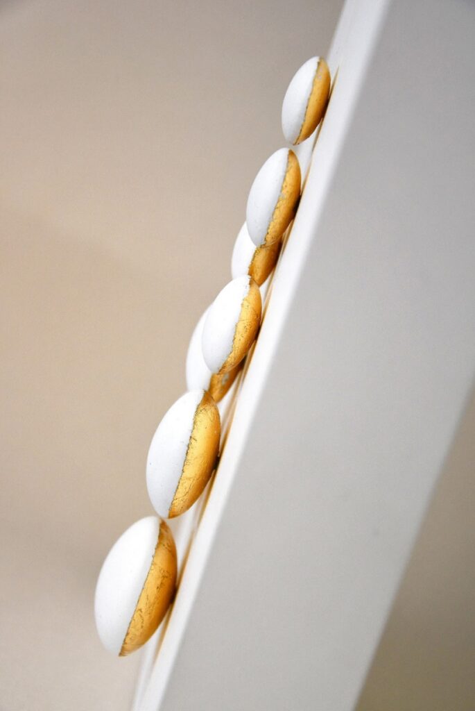
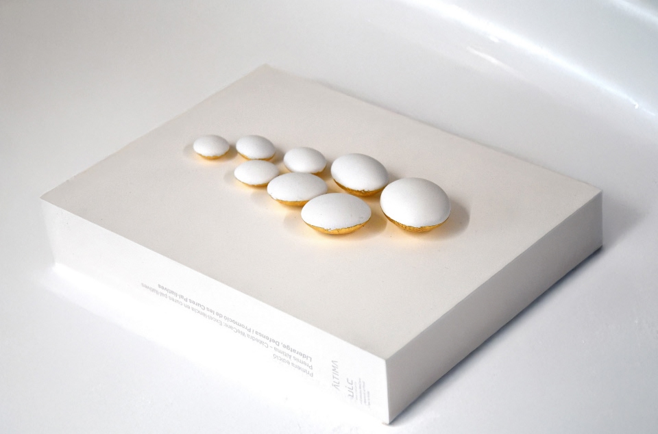
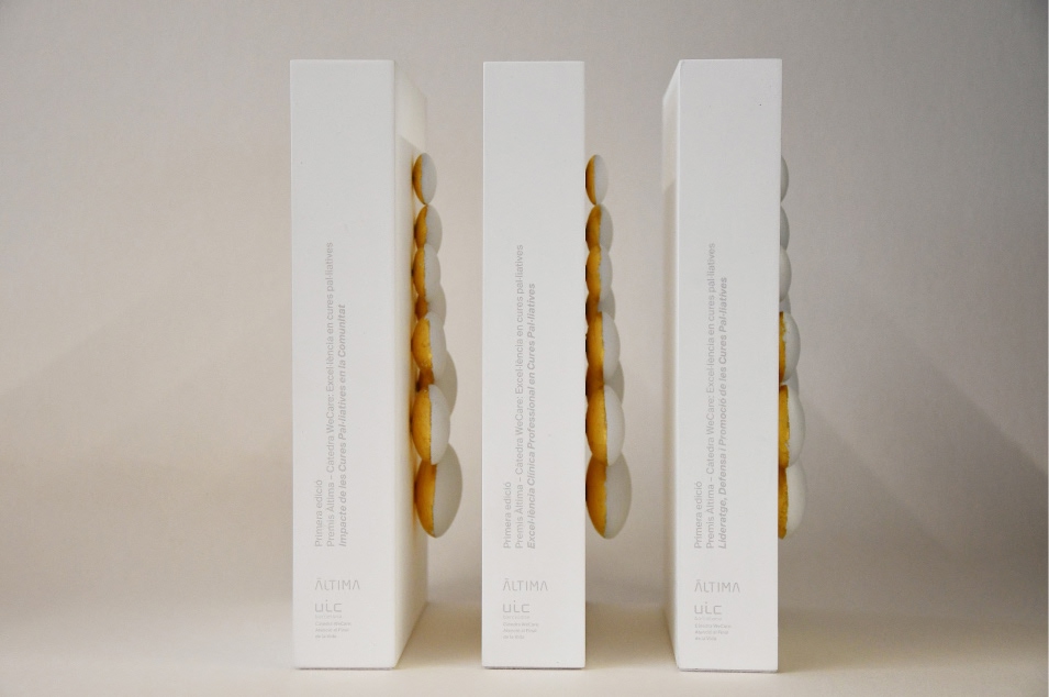
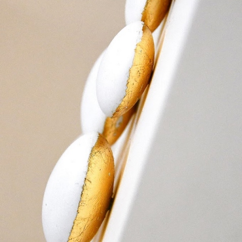
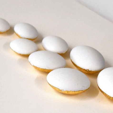
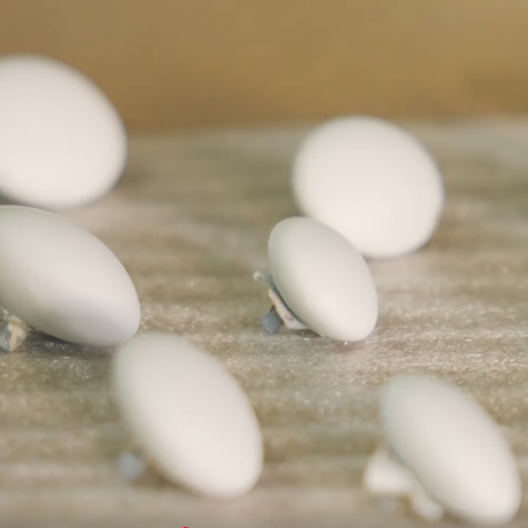
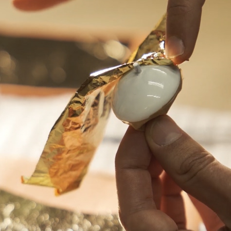
They had a clear element, which was of the ear of wheat, and was the starting point for creating the trophy. I think it symbolises resilience, so important in the world of palliative care. After a few days thinking about it in the studio, we put three elements on the table: the ear of wheat, the colour white and the light. We wanted to graphically represent the main element of the ear of wheat with pebbles, which symbolise the seeds. We decided that these pebbles would be white, a colour that represents scientific work and rigour for me, and at the same time transmits a feeling of tranquillity. Finally, it was clear that the trophy should be clear and bright. We also wanted to give the light a layer of golden leaf, present behind these seeds.
Why did you decide to put this gold leaf behind the seeds?
It is the noblest part of the trophy, and at the same time the one that is not seen. As with people, what matters most is the interior and the soul; I wanted light to reflect this most vital and spiritual part of the trophy.
Light is also a central element of the trophy.
It is the most spiritual part of the proposal. Palliative care at the end of life is like a ray of light, and white and gold leaf help to reflect this most vital aura of the trophy. We had thought about making a more technological trophy, to physically light it up, but it was too artificial. This is why we used the gold leaf. To work with reflection, more than with light. I think it gives it the warmth that is also given by health professionals to people at the end of their lives.
What made you participate in such a project?
Being able to contribute to initiatives that have a very powerful poetic and spiritual component is incredibly beautiful, and I feel very comfortable with them. I try to get to the foundation of things, to do a lot with very little. Some say I’m minimalist, but I don’t think so. I try to escape the fireworks. Once they burst, they disappear, and I want my work to last longer in time.